
Computer Lab Management
Timeline
10 weeks
Role
Product Design
Tools
Figma
Team
Joe Castillo / Project Manager

Overview
Context
As part of my promotion to Senior Media for the Computer Room Consultant team, I took on a capstone project aimed at redesigning and improving the Computer Lab Management, or CLM, applications. These internal tools are essential for daily lab operations, but they had become outdated and fragmented. The CLM portal was originally built in the early 2000s. Over time, it was expanded by different developers using different tech stacks, which caused the system to become inconsistent.
The Mission
The objective of this project was to research, redesign, and create a unified design system for CLM applications, streamlining workflows for both student consultants, admin, operational support, and lab managers.
PREVIEW
Solutions
LITERATURE REVIEW
These internal tools had become outdated and fragmented.
My first step was to understand the constraints of the Computer Lab Management Design Library System (DLS) and find components I can leverage. I began by cataloging interface elements such as inputs, data display, feedback, and navigation. I researched in-class examples of existing React component libraries, such as Shadcn and Tailwind UI.
USER RESEARCH
Students and faculty struggle with the current design and organization
Before diving into the redesign, I first had to understand where the current problems were. Our primary users were Student Consultants logging and viewing data, and Supervisors and Lab Managers managing data. I interviewed both types of users, observing their distinct use cases for the site to gain comprehensive insights into its usability.
I conducted behavioral testing by observing each user group interact with the existing CLM apps while performing real tasks, such as logging IT issues or searching the Lost and Found database. During these sessions, I noted differences in task completion times, navigation strategies, and which features were used most or overlooked, uncovering specific pain points and inefficiencies unique to each role.
INSIGHTS
Key pain points: Navigation, Communication, and Error Handling.
From our user interviews, I created a product requirements document where we recorded and categorized our user’s suggestions by priority and concluded our three main issues:
DEFINE
Students, faculty, and external users have different access levels
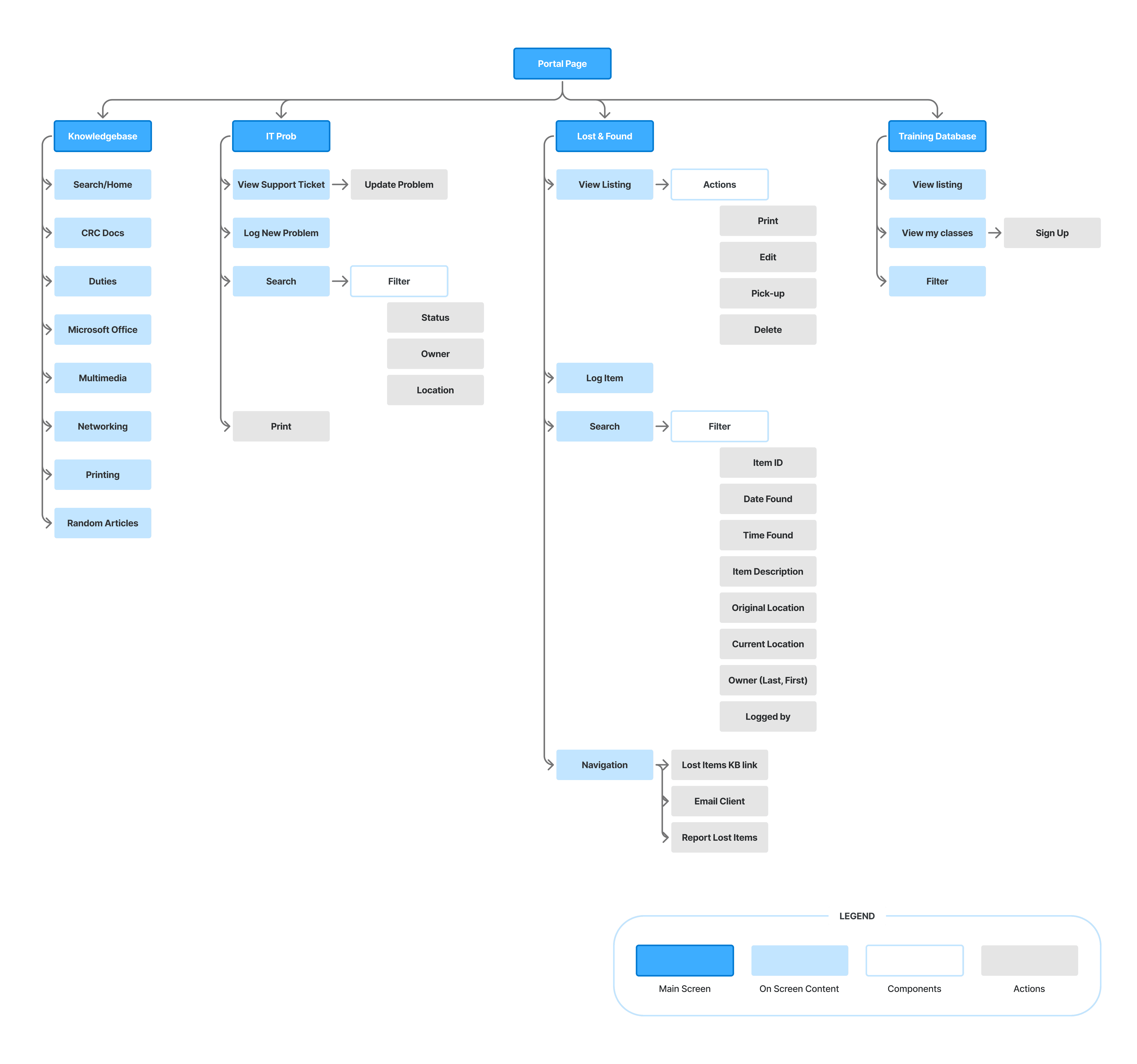
The existing website had four main tools: the Training Database, Lost and Found Database, IT Prob, and Knowledgebase. To understand how and where to implement changes, I created a comprehensive information architecture of the current website.
Given the amount of information and unique functionalities of each of the pages, the information architecture helped us pinpoint which of our three main issues—organization, clarity, and forgiveness—we needed to focus on for the page.
IDEATE
Our redesign should maintain familiarity and not disrupt their current workflow
A significant challenge we encountered was finding the optimal layout that not only met our users’ needs effectively but also ensured consistency and coherence across all pages. I began with sketches but did most of the iteration on Figma to get a sense of how much information there was to fit. This was especially important given the amount of data visualization elements that make the pages easily look cluttered.
It was important that we maintained a uniform design would establish familiarity throughout the website making it easy to use for current and even new members who join the computer lab.
MID-FI DESIGNS
Balancing functionality and clarity in data presentation
I focused on integrating the app's core functionalities with an optimized layout. I presented data in a digestible manner, addressing user needs for clarity and efficiency. I utilized various tables and cards that allowed the flexibility needed to display varying amounts of information across different pages. This approach allowed me to tailor the presentation of data to the specific context of each page which keeping a consistent user-experience.

USABILITY TESTING
Simplifying time pressure, information overload, and error-prone
I conducted usability and A/B testing to ensure the redesign addressed real consultant pain points—primarily time pressure, information overload, and error-prone workflows.
Consultants needed to triage tickets quickly and confidently, so I simplified dense tables, introduced clearer spacing and visual status indicators, and redesigned updates into split-screen layout. This reduced cognitive load, minimized context switching, and made critical information immediately visible, allowing consultants to respond faster and with fewer mistakes.
For Lost & Found, consultants were frustrated by constantly navigating between pages during edits. By replacing the multi-step form with an in-context modal, they could make updates without losing their place, resulting in quicker task completion, fewer errors, and a smoother overall workflow—especially during busy shifts.

Solution
FINAL PROTOTYPE
Knowledgebase
I improved navigation by introducing stronger visual hierarchy, clearer emphasis, and collapsible sections, making key information easier to access at a glance while preserving its strong search functionality.

FINAL PROTOTYPE
IT Prob
I redesigned managing support tickets with clearer actions, reorganized tables to prioritize recent items, and surfaced filtering tools—resulting in a more intuitive experience and faster task completion.

FINAL PROTOTYPE
Lost and Found Database
For locating items, I streamlined the layout to emphasize key columns, improved sorting tools, and added helpful guidance—reducing frustration and enabling faster lookups.

FINAL PROTOTYPE
Training Database
The Training DB lacked intuitive navigation, making it frustrating—especially for new student consultants, with the absence of a back button being a major pain point. I introduced consistent navigation elements and clearer header hierarchy, creating a smoother, more user-friendly onboarding experience.

DESIGN SYSTEM
Designing for scalability
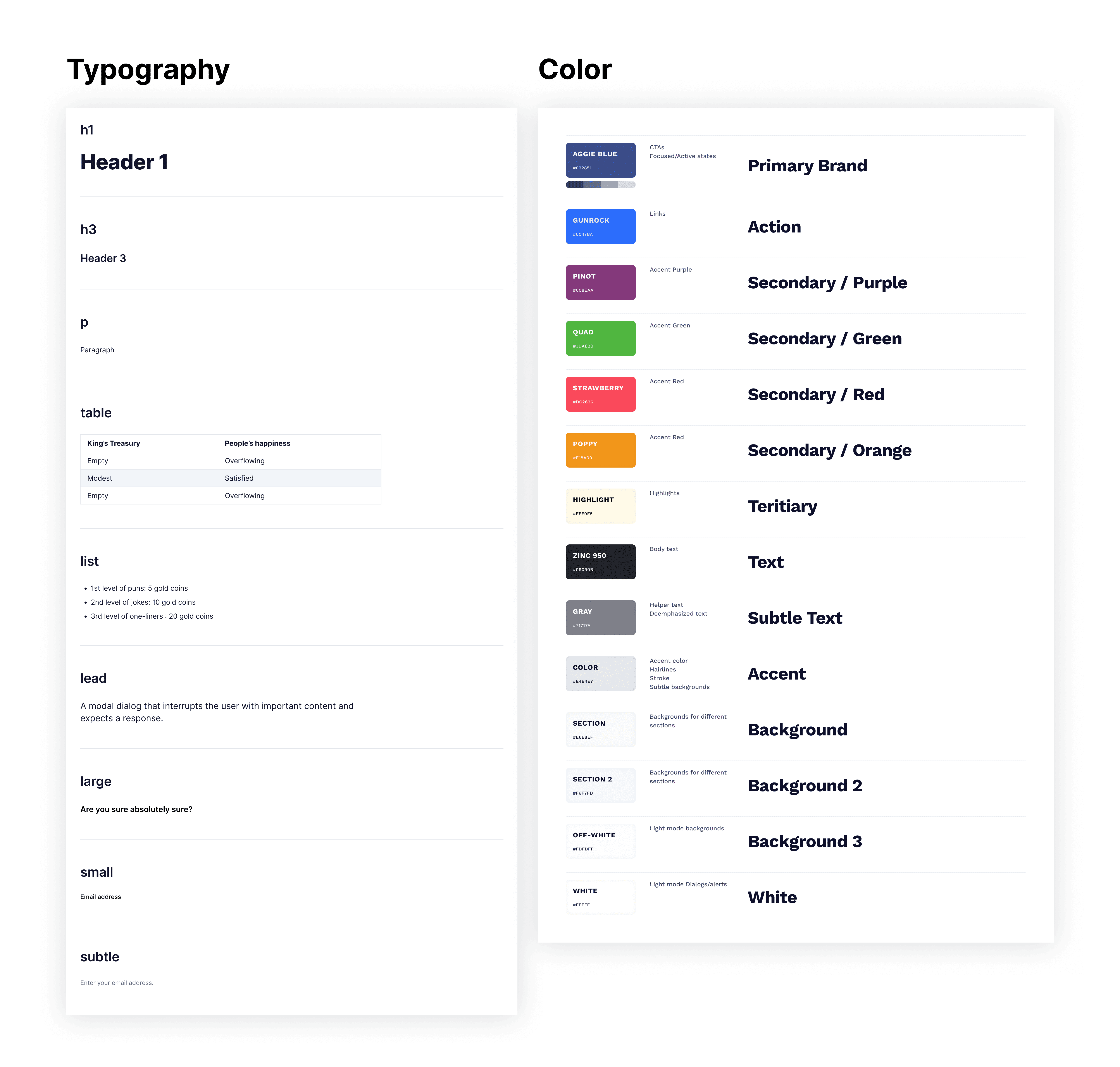
My goal for our design system was to modernize the UI for a better user experience while maintaining core functionalities. I used Shadcn UI components to streamline development, added subtle drop shadows and rounded elements for a contemporary look, and used a blue to highlight key interactions while incorporating the existing logo colors.
HANDOFF
Constant design enhancements and documentation
I incorporated feedback from user-testing, development, and my manager, ensuring consistency across the design system. Some modifications included a condensed filter panel to reduce clutter, and consistent placement of buttons to improve usability.
To prepare for a smooth handoff, I created documentation of spacing, components and assets as well as annotations of final designs.

Next Steps
Launching our product
We are excited to continue beta testing with the lab's next wave of support tickets, preparing for launch around the end of the year, and ensuring proper handoff of documentation to ensure the application will be properly maintained.
REFLECTION
Challenges and Takeaways
01 Understanding complex user flows
Due to the complex nature of our consultants' work, I learned the importance of knowing your product inside out and to never stop asking questions. Before I could begin even thinking about designing, I first had to understand how different groups of members used the website for certain tasks. Once I accomplished this, it clarified the areas for improvement for design and product features and allowed us to make educated decisions.
02 Determining feasibility of additional features
While my user-interviews were extremely valuable to understand our users, I had to distinguish what suggestions were absolutely necessary vs nice-to-haves. To solve this issue, I created a product requirements document allowed us to categorize features by lowest and highest priority, and it ensured I had a defined end goal that was realistic for my short timeline.
03 Maintaining consistency
When ideating on design changes, I had to consider how one page would look and function in relation to other pages of the website too. This meant establishing a clear information architecture.