
Davis Design Fest 2025
Timeline
24 hours
Role
UI/UX Design
Tools
Figma
Team
Nanette Ta
Juan Alvarez
Overview
Context
I was one of three designers for this student project. This project was done over the span of 24 hours at the 2025 UC Davis Designathon. My team and I made the top two finalist and were awarded runner-up Best Overall Design among 200+ designers and 30+ teams.
The Mission
The prompt this year was to design a digital experience that demonstrates the transformative power of design by creating moments of insight, connection, or growth. Focus on challenging perspectives, fostering meaningful interactions, or driving lasting emotional impact.
My team chose to focus on a sensitive demographic—domestic abuse survivors—aiming to create a design that is empathetic, empowering, and attentive to their unique needs.


PREVIEW
Solutions

LITERATURE REVIEW
Without direct user access
Before touching the visual elements of design, my team and I started off with white paper research.
With limited direct access to users, I had to think creatively about gathering actionable insights, a challenge that strengthened our adaptability and problem-solving skills. We couldn’t conduct traditional interviews. Instead, I reviewed academic papers and psychological research on the impacts of abuse and help-seeking behavior.
RESOURCES
Analyzing risk assessment frameworks to inform safer design
I analyzed public materials from shelters, hotlines, and legal services—particularly around escape planning and assessment tools. What caught my eye during this research were tools like the Danger Assessment and the Lethality Assessment Program provided frameworks for understanding risk.
USER RESEARCH
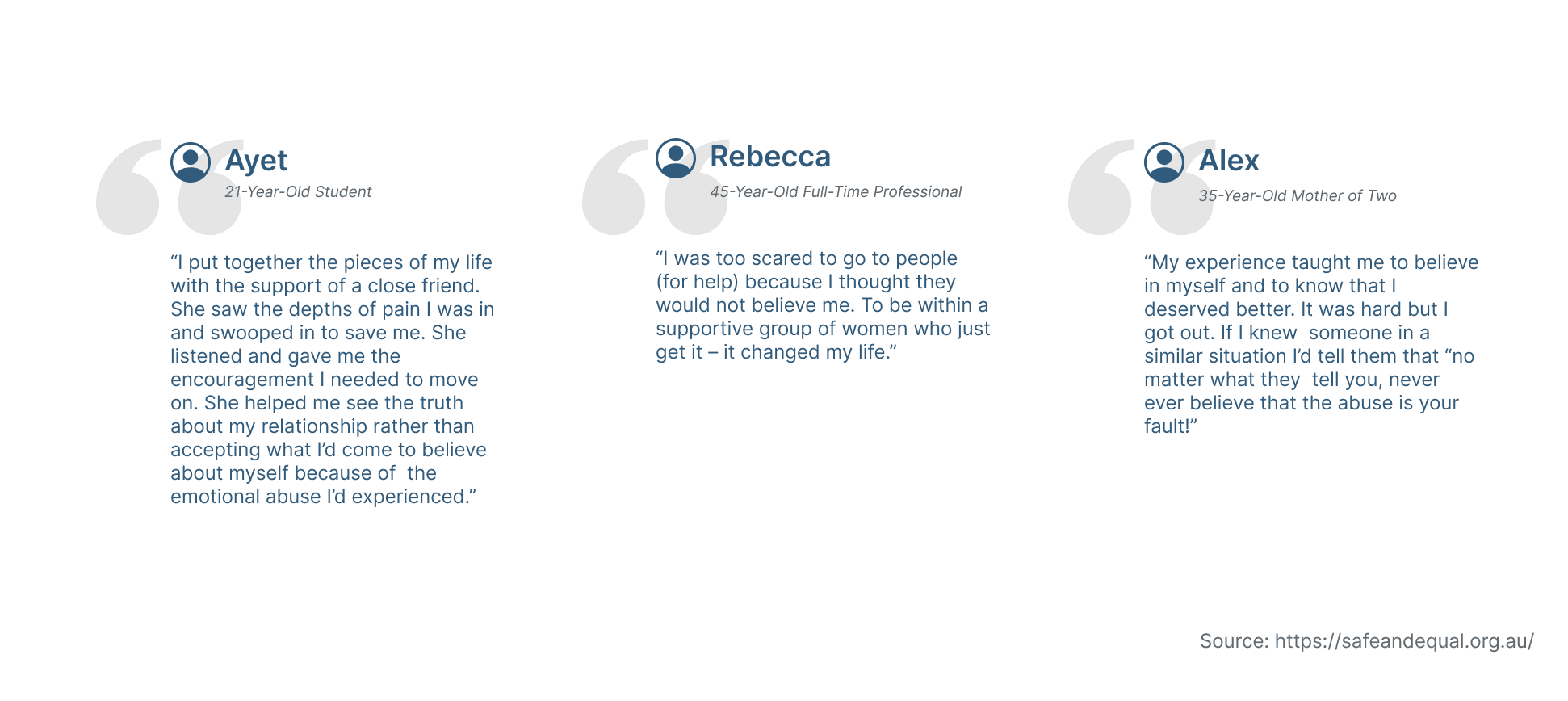
Testimonies
I sourced testimonies from survivors published by support organizations and online campaigns to better understand lived experiences, emotional needs, and real-world barriers to seeking help. These narratives offered insight into moments of hesitation, fear, and decision-making that formal reports often overlook. By analyzing recurring themes—such as safety planning, financial dependence, isolation, and mistrust of systems—I was able to ground design decisions in authentic voices rather than assumptions.
These testimonies also shaped the tone of the platform. Instead of clinical or overly directive language, I prioritized clarity, empathy, and empowerment—ensuring the experience felt supportive rather than overwhelming.
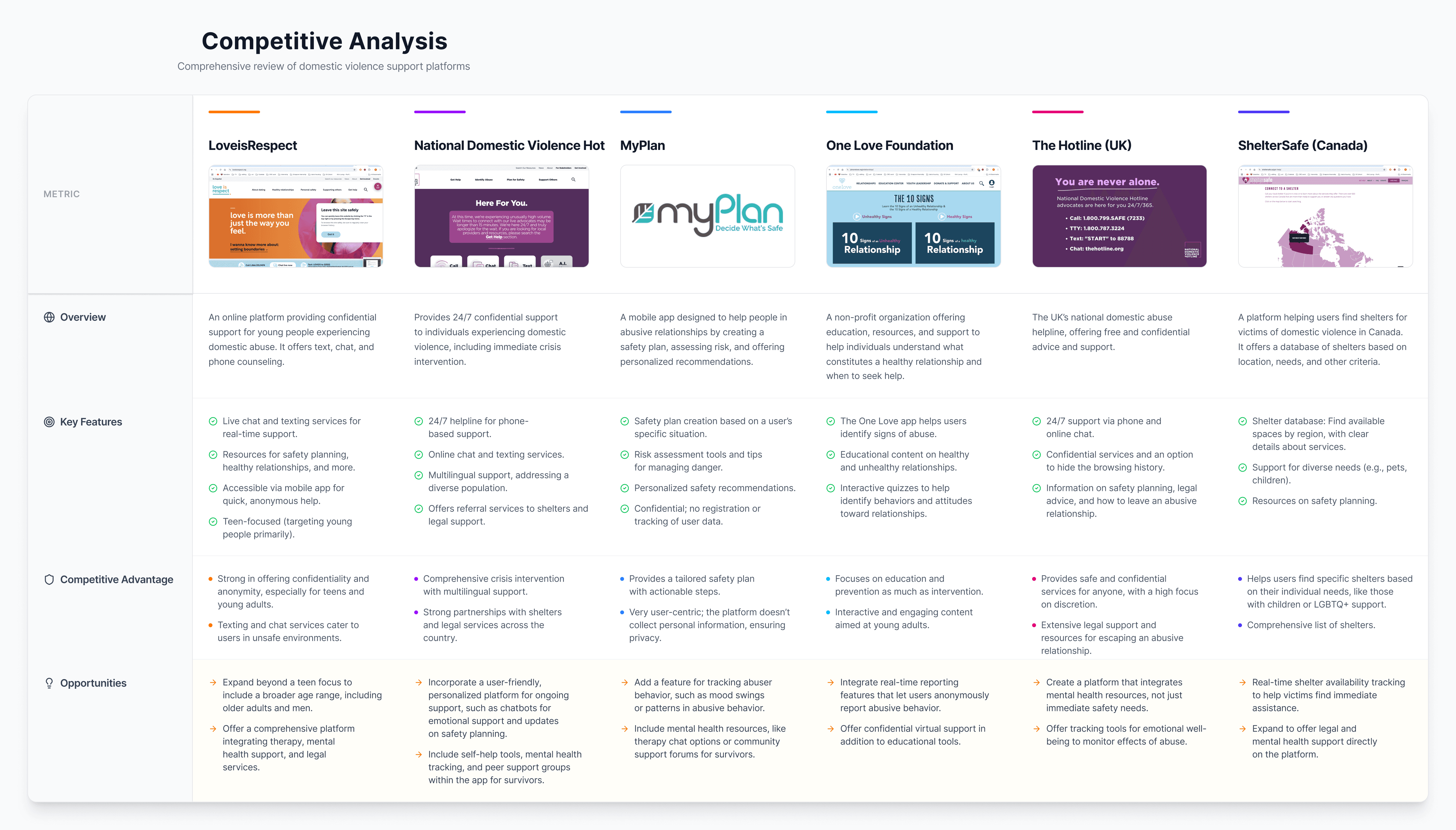
COMPETITIVE ANALYSIS
Identifying gaps in existing DA platforms
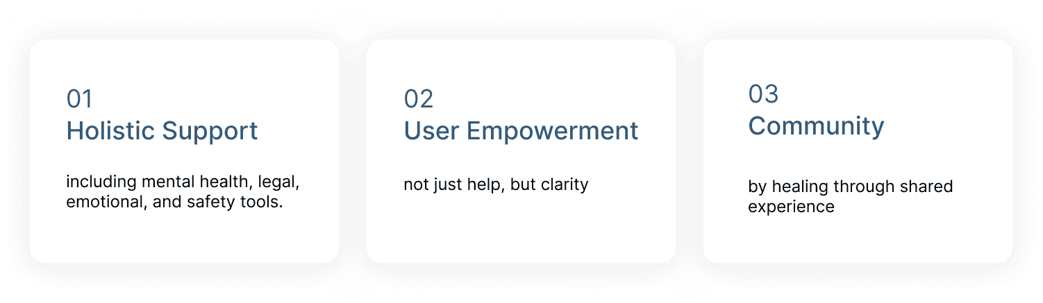
What I found from most of DA platforms were resource-heavy content, but few offer customized experiences based on risk or background. Few have stealth features or anonymous communities.
Instead, areas of focus my team and I considered were:
INSIGHTS
Key pain points: Emotional, Cognitive, and Awareness Gaps
We identified key challenges including fear of discovery, dependency, isolation, identity loss, and deep emotional trauma. Research revealed that many survivors don’t label their experiences as abuse, stay silent due to fear or stigma, and lack awareness of available legal or emotional support. These patterns informed features such as discreet app access, emergency contacts, risk assessments, community support forums, and secure document storage.
DEFINE
Students, faculty, and external users have different access levels
To ground our design in a real, relatable story, I developed two different user personas:
Anna a gentle and timid teacher who seeks safety, understanding, and supportive resources
Marcus, a defensive and outspoken professional who masks his vulnerability with toughness.
Together, these personas demonstrate the diverse ways survivors experience and cope with abuse—whether through silence or defensive posturing. Including both perspectives in research is essential to designing interventions that address stigma, provide tailored resources, and reach survivors who may not fit stereotypical narratives.

WORKFLOWS
Students, faculty, and external users have different access levels
To establish a rough outline, I developed a guiding framework for the app, envisioning the registration, accessibility to resources, community, and discreet exiting processes. The information architecture helped us pinpoint which of our three main issues—security, clarity, and empathy—we needed to focus on for each page.
IDEATE
Translating survivor insights into trauma-informed product decisions
Using these patterns, I translated insights into trauma-informed feature definitions. These included a discreet entry and exit system to protect user safety, emergency contact functionality, evidence-based risk assessments modeled after LAP and DA frameworks, community-driven support spaces, and secure, optional document storage. Throughout the process, I ensured that every research insight directly mapped to a functional design decision, grounding the product in empathy, safety, and real survivor needs.

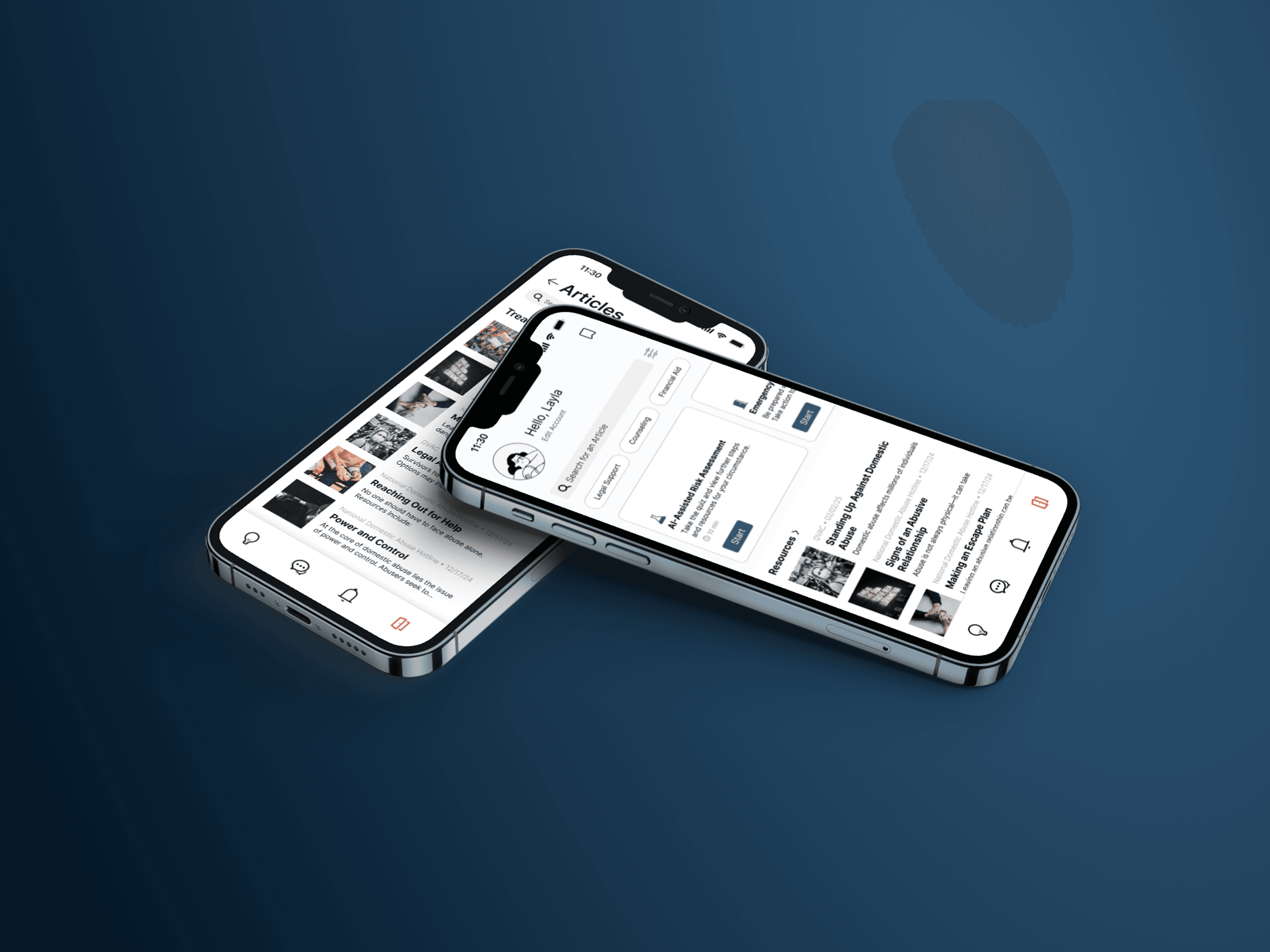
FINAL PROTOTYPE
Access Local Resources
Our Resources tab which acts as a reliable, easy-to-navigate hub where users can learn about their rights, understand types of abuse, and explore options for legal aid, shelter, counseling, and more.

FINAL PROTOTYPE
Understanding your situation
Take the AI-powered risk test based on the John Hopkin’s danger assessment used by first responders and domestic violence professionals to assess if the survivor is in danger
Complete a 5-step escape plan drawn from organizations like domesticshelter.org, the national domestic abuse hotline, and womensaid.org

FINAL PROTOTYPE
Build Community
Unlike traditional social platforms, Threads emphasizes privacy and emotional safety, using filters and moderation practices that prioritize survivors’ mental health. Users can create and view forums without having to sign in, and they will be randomly assigned a generated user and profile picture.

FINAL PROTOTYPE
Exit Safely and Discreetly
Lets users quickly and discreetly exit the app, instantly redirecting them to a neutral screen—like a calendar or homepage—to avoid suspicion if someone walks in or checks their phone unexpectedly.

DESIGN SYSTEM
Designing for empathy
When designing Sanctuary’s interface, I paid close attention to the emotional state of our users. Survivors of domestic abuse often experience anxiety, fear, and are overwhelm—so I knew our visual design had to be soothing, intuitive, and non-triggering.
I chose a cool-toned color palette. These colors evoke calmness, trust, and stability, helping to ease users into a state where they can explore their options without feeling overstimulated or on edge.
I avoided clutter by using consistent typography and structured content to reduce cognitive load. This way, users can quickly find critical resources, like emergency plans or local shelters, even if they’re only able to engage with the app for a few minutes at a time.
Our design system is intentional and trauma-informed. It isn’t just about looking good—it’s about creating a quiet, safe, and empowering experience, where users can feel in control again, even in moments of crisis.

Next Steps
Advancing the Design Through More Research and Iteration
Given more time, we would continue deepening research and strengthening safety. To ensure the platform meaningfully supports survivors, we would conduct user interviews with survivors and support organizations to gather firsthand insights, validate assumptions, and better understand real-world needs.
The platform will continue to evolve through iterative design cycles, refining content, user flows, and accessibility based on ongoing feedback.
Finally, usability testing would validate navigation clarity, emotional tone, and overall trustworthiness—ensuring the experience feels safe, supportive, and empowering at every step.
REFLECTION
Challenges and Takeaways
01 Working with what you have
I learned the importance of working with what you have. Since my team and I couldn’t safely interview users face-to-face, we had to get creative—pulling insights from survivor stories, academic research, and real-world tools like the Danger Assessment. It pushed us to be resourceful and thoughtful with every choice. We kept our research limitations in mind every step of the process.
02 Design with intentionality
I kept coming back to the idea of designing with intention. In a project like this, where safety, privacy, and emotional care are at the core, every design choice—whether it's a color, a button label, or a feature—has to be made on purpose.